
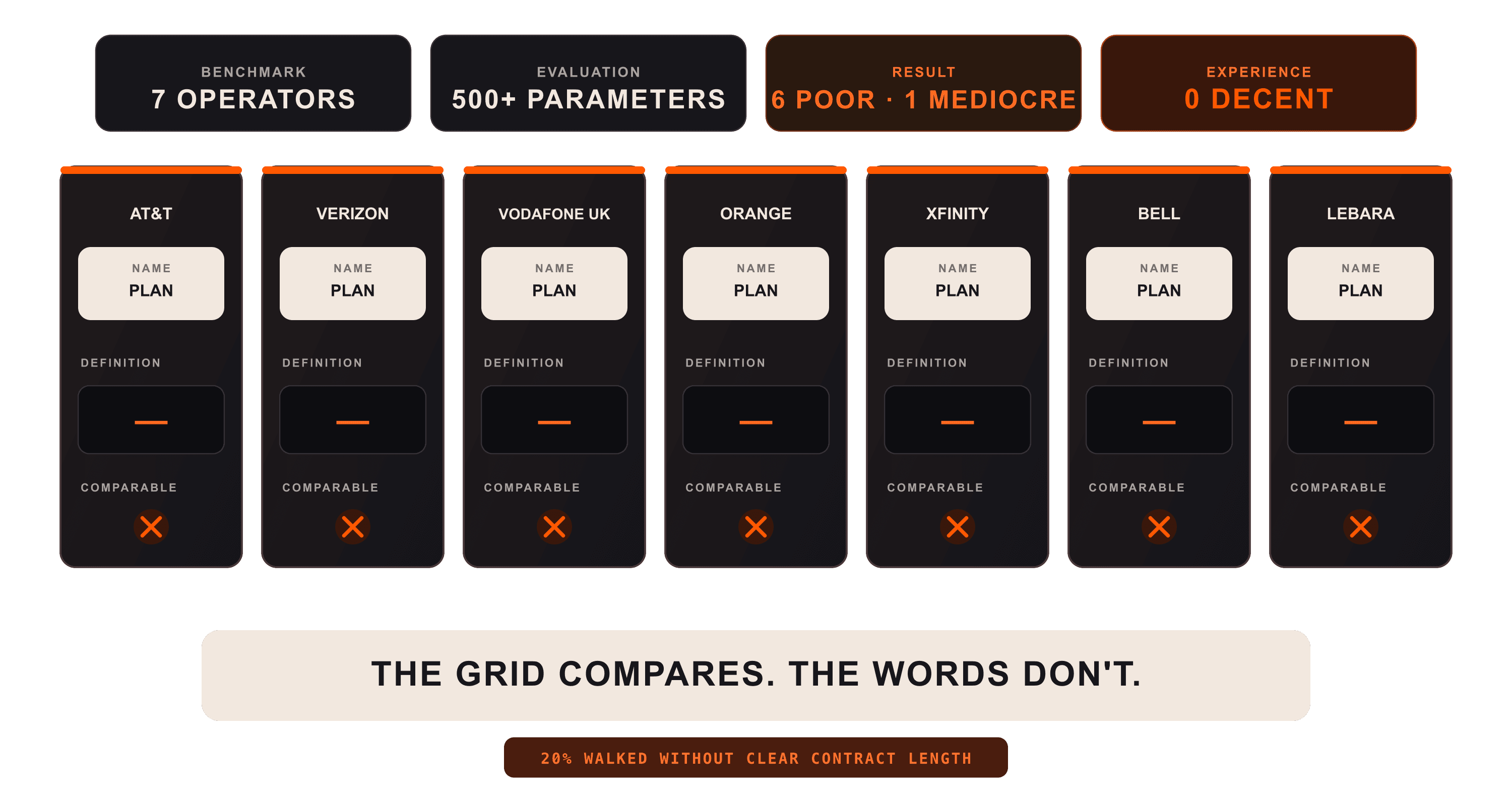
Baymard published a benchmark of seven mobile operators on 1 September 2026, scoring AT&T, Verizon, Vodafone UK, Orange, Xfinity, Bell and Lebara across more than 500 UX parameters. The overall result is "poor", one site reaches "mediocre", and not one delivers even a "decent" experience. The seven fail on the same thing, and it is not how the sites look. It is that none of them explains the words it sells with.
That has a measured price. In a separate study published on 22 October 2025, built from more than 290 moderated think-aloud sessions across 16 US and UK operators, 85% of participants abandoned at least one site during their session, and every site tested was abandoned by somebody. Where contract length was not obvious in the plan list, 20% of participants walked away from plans that suited them.
What "labels without explanation" means
Baymard's summary of the benchmark is that "proprietary plan names and technical specifications were presented as labels without explanation", and that no site "explained its industry-specific filters or provided inline help for technical specifications within comparison features". Comparison, it reports, "was obstructed at every level, from plans to handsets to network coverage". These are labels that are present and still say nothing, which is the same shape as alt text that passes an automated check without describing anything: the field is filled, so nothing flags it.
You can watch it happen without a research budget. Verizon's coverage page offers to show you "5G Ultra Wideband, 5G, 4G LTE, Satellite SMS, and more", then asks and answers "What is 5G Ultra Wideband?" and nothing else. The answer is that it is "Verizon's fastest 5G. Compared to typical 4G speeds, it's faster, and responds quicker", which contains no number and no threshold. Several tiers named in one line, one of them defined, and that definition is a comparison against another undefined tier.
A participant in the 2025 study, looking at a feature called the "Easy Unlock and Go Back Guarantee", said: "what is that? I don't know. Like, what does that mean?…Why did they even put that in there without an information thing next to it?" Baymard's reading is that an unexplained feature stops being a selling point and starts adding uncertainty.
Five years, same two bands
Baymard ran this benchmark before. In July 2021 it scored five operators, Bell, Verizon, Vodafone UK, Orange and Xfinity, all five of which are in the 2026 set, and reported that "all 5 Telco sites have a poor to mediocre UX performance". Five years on, the field sits in "poor" with one site at "mediocre". The two runs are not a like-for-like measurement, because 2021 used 400+ parameters and 2026 uses 500+, and Baymard does not present them as a trend. What both pages say on their face is that the field has stayed in the bottom two bands across five years of redesigns.
Worth saying plainly: Baymard sells UX audits, and the benchmark page ends by offering one. What makes the research citable anyway is that the method, the parameter count and the site names are all published, so any reader can go and check a specific claim on a specific site. That is what we did with Verizon.
A regulator already asked for this
In December 2019 the European Commission wrote into law a template for the contract summary that telecom providers must hand over before a customer is bound, and the reasoning reads like a description of the benchmark. The summary "should be easy to read, understand and compare, with a common structure and format". It should not exceed "one single-sided A4 page". It should carry "key information that the consumer needs to compare offers and to make an informed decision". And, in one sentence that could be pasted straight onto the 2026 results: "Specialised language, technical jargon and acronyms should be avoided."
That rule governs the contract summary, not the plan listing. So the clarity is mandated at the moment you sign and missing at the moment you choose, which is the wrong way round: by the time the standardised page arrives, you have already picked. Our read is that the industry treated a legibility requirement as a compliance document rather than as a description of what the whole path should do.
What it actually takes to fix
None of the failures in the benchmark is a visual problem. A contract length missing from a listing, inconsistent units between specifications, a filter nobody explains, a plan name with no definition: each of those is a decision about vocabulary and about what customers are supposed to be able to put side by side. Those decisions belong to whoever owns pricing and packaging, not to whoever owns the interface.
That is why this survives redesigns. A project that starts from screens inherits the vocabulary it was handed and ships the same confusion in a better grid. Our position is that settling the words is part of the design work rather than something that should have happened before it: what each term means, which attributes every plan has to state, in what unit, and what the customer is meant to be able to compare. Get that wrong and no interface rescues it.
There is one reading we cannot rule out and it is worth naming: that the obscurity is the product rather than a defect, because a customer who cannot compare cannot leave. Nothing here establishes intent for any of the seven, and we are not claiming it. But if the benchmark five years from now still shows the same two bands, the charitable explanation gets harder to hold.
Sources
- Telco UX Benchmark: 3,100+ Performance Scores, Baymard Institute, 1 September 2026.
- New Telco UX Research: 3 High-Level Takeaways from 3,500 Hours of Testing, Baymard Institute, 22 October 2025.
- 17 Common UX Pitfalls Telco Websites Suffer From, Baymard Institute, 27 July 2021.
- Commission Implementing Regulation (EU) 2019/2243, European Commission, 17 December 2019.
- Verizon coverage map, read 3 September 2026. Our own check, not a Baymard finding.
![[object Object]](/_next/image?url=https%3A%2F%2Fres.cloudinary.com%2Fdh1xrwguk%2Fimage%2Fupload%2Fv1792141593%2Fblog%2Fwhile-loading-story-starts-en-transparent.png&w=3840&q=75)
![[object Object]](/_next/image?url=https%3A%2F%2Fres.cloudinary.com%2Fdh1xrwguk%2Fimage%2Fupload%2Fv1791397083%2Fblog%2Fai-every-recommendation-cover-en-v3-transparent.png&w=3840&q=75)
![[object Object]](/_next/image?url=https%3A%2F%2Fres.cloudinary.com%2Fdh1xrwguk%2Fimage%2Fupload%2Fv1790966353%2Fblog%2Fbook-of-shapes-rules-v3-transparent.png&w=3840&q=75)