
Stack some horizontal lines. Push each one up and down with random noise. Make the push strong in the middle and let it fade to nothing at the edges. That is the whole recipe Book of Shapes gives for the cover of Joy Division's Unknown Pleasures, and when you read it, the image appears in your head before you see it.
A finished image can only be copied. A rule can be moved: to a phone screen, a banner, a square post, a size nobody planned for. If you commission a visual identity or build a product with a graphic language, that difference decides whether the artwork survives the next format or gets redrawn by hand.
What Book of Shapes is
Book of Shapes is a collection of what its author, the designer Nikolaj Sokolowski, calls "minimal, generative and customizable SVG-patterns". Generative means produced by instructions rather than drawn once; SVG is the vector format browsers use for graphics that stay sharp at any size. Each pattern can be adjusted before you download it.
The interesting part is the caption under each pattern. It describes how the thing is built. The Joy Division entry talks about simplex noise, a smooth kind of randomness, and about a "bell-shaped envelope": a curve that decides how much of the effect each part of the image receives.
The original was a method too. According to Scientific American, the chart comes from Harold D. Craft Jr.'s 1970 PhD dissertation at Cornell: 80 consecutive radio pulses from the pulsar CP1919, stacked one above the other. Peter Saville used a white-on-black version for the album in 1979. The album icon started as a data plot with a rule: draw each pulse below the previous one.
We tried moving a rule across three formats
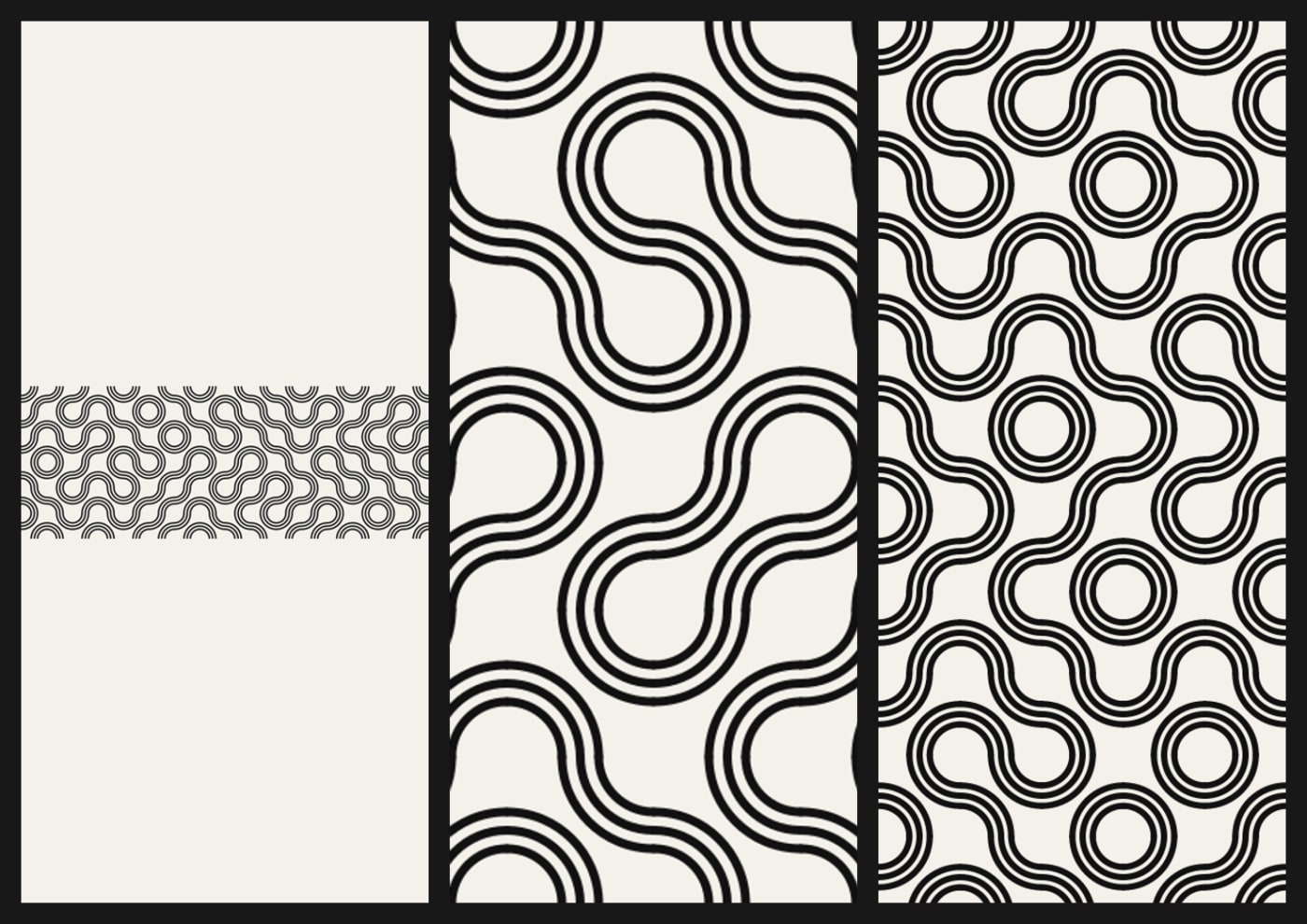
To test the idea outside a gallery, we used a much older rule. In 1704 Sébastien Truchet published a memoir on combinations of square tiles split by a diagonal. Book of Shapes includes a version built from quarter-circle arcs. Ours, written from scratch without its code or definitions, draws concentric quarter circles in two opposite corners of each tile, so randomly rotated tiles join into continuous winding lines.
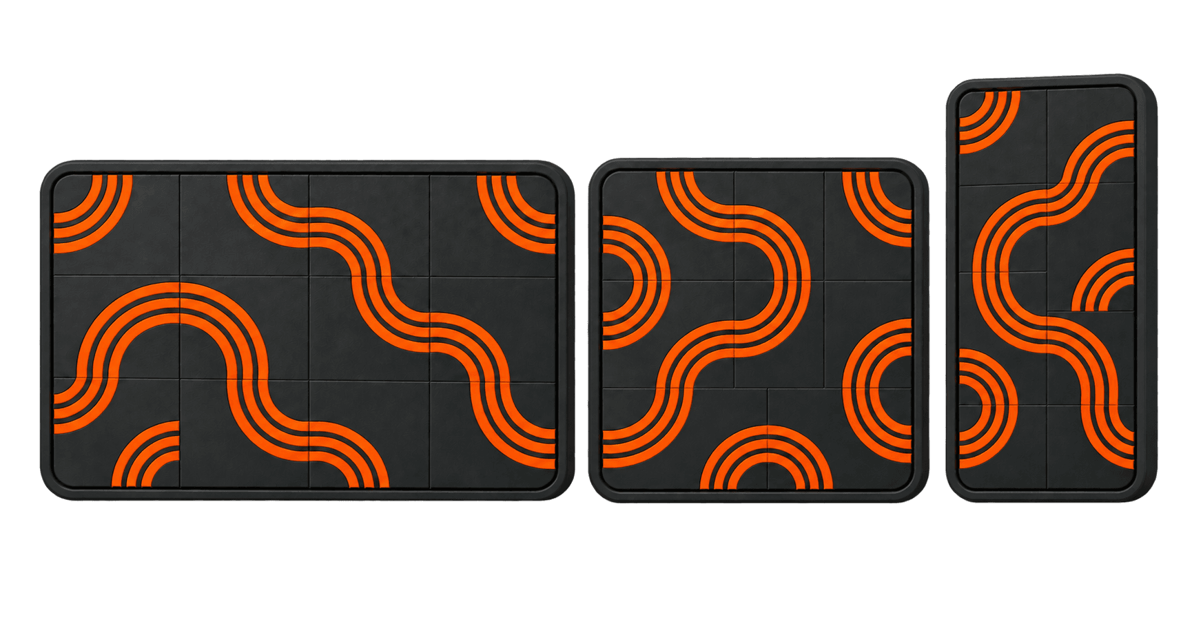
We drew one artwork for a 1600 × 600 pixel web hero, then moved it to a 390 × 844 phone screen and a 1080 × 1080 square: first as an image, then as a rule.
Fitting the finished hero inside the phone screen left 83% of the screen empty, and the 6 pixel lines shrank to about 1.5 pixels. Cropping it to fill the screen instead showed only 17% of the original width, with lines swollen to 8.4 pixels. Neither looks broken. Both quietly turn the drawing into something else.
Running the rule again per format was uneventful, which is the point. Tile size followed the short side of each screen, the line stayed 6 pixels, and the phone got a 5 × 11 grid while the square got 6 × 6. The three outputs read as one family because they are the same instructions, not the same pixels.
The part we got wrong first
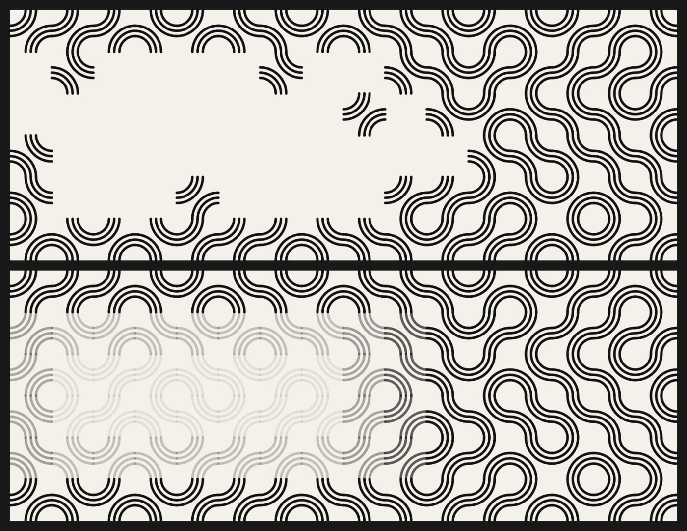
A pattern behind a headline needs to get out of the way of the text. Our first attempt removed tiles near the copy. The ink under the text dropped to almost zero, and the pattern fell apart: in a Truchet tiling every tile completes its neighbours' lines, so deleting tiles leaves stubs hanging in the air. The continuity was the identity, and we had cut it.
The second attempt kept every tile and lowered the opacity tile by tile. The lines survived, but the grid showed up as steps of grey.
What worked was a soft mask that ignores the grid entirely: a blurred area where the whole drawing fades. Measured as the share of dark pixels in the text area, coverage fell from 27% to 7% on the hero and from 36% to 9% on the phone, with no line cut. It is the same move as the bell-shaped envelope in the Joy Division rule. The rule includes where it should stop acting, and that "where" has to be as smooth as the drawing itself.
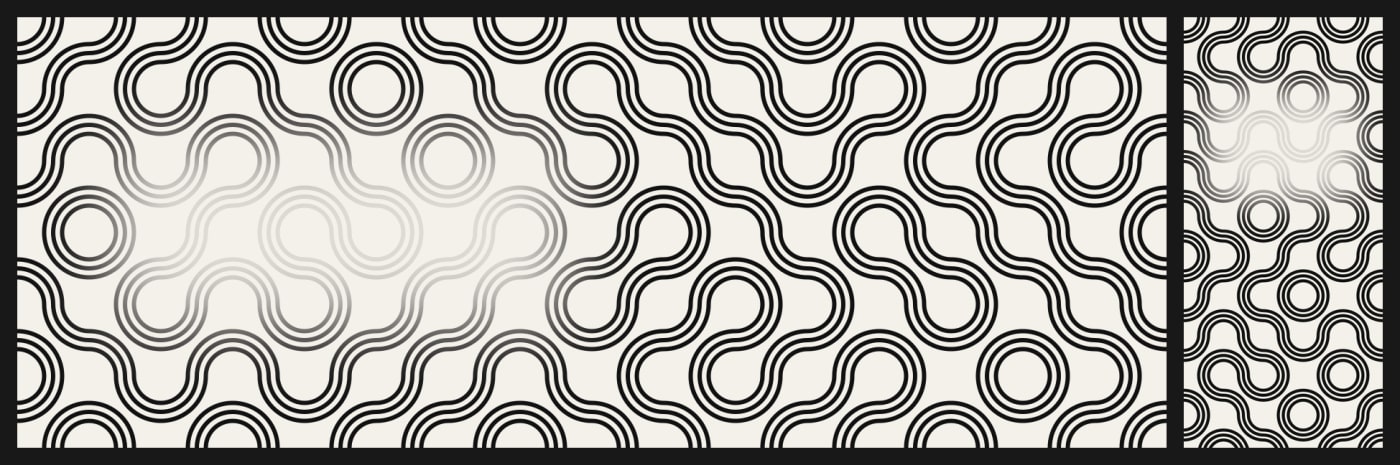
These numbers come from one pattern, one random seed and text areas placed by eye, and measure darkness rather than real text contrast. Read them as a demonstration, not a benchmark.
Rules are not automatically original
A shared library also makes it easy for everyone to land on the same result. A March 2026 paper on AI-generated websites, by Shin and colleagues, argues that generative tools tend to reproduce "dominant style conventions" and proposes "productive friction" so creators challenge the defaults. The paper is about AI, not pattern libraries, but our read is that the risk transfers: a popular pattern on default settings becomes the next stock photo.
Book of Shapes draws its own line on originality. Its licence lets you use what you generate commercially, without attribution, but not resell the patterns as a pack or a generator: "a pattern can be part of what you sell. It cannot be the thing you sell." Three patterns are excluded altogether because they recreate existing works, including the Joy Division one. You may study them, but not publish or sell them, "least of all on a record sleeve or a poster, where the resemblance is the whole point". This is not a legal reading. The design lesson is that taking an image apart into rules does not transfer ownership of the image.
What to ask for
If you are commissioning a brand or a product's visual language, ask for the rules along with the files: what varies, what stays fixed, how the artwork behaves at a new size, and where it gives way to content. A designer who can write that down has a system. One who can only export another PNG has a picture.
Worth watching over the next year: whether design tools start shipping artwork this way by default, with envelopes and quiet zones as editable parameters, or whether rules stay a niche for people who read the captions.
Sources
- Book of Shapes, collection, Joy Division pattern and licence (licence last changed September 2026), accessed 2 Oct 2026.
- Jen Christiansen, "The Pulsar Chart That Became a Pop Icon Turns 50", Scientific American, 1 September 2020.
- Jacques André and Denis Girou, "Truchet stories: tiling systems", 1998, on Truchet's 1704 Mémoire sur les combinaisons.
- Shin, Gao, Pang, Lee, Reinecke and Tseng, "Interrogating Design Homogenization in Web Vibe Coding", arXiv, 13 March 2026.
![[object Object]](/_next/image?url=https%3A%2F%2Fres.cloudinary.com%2Fdh1xrwguk%2Fimage%2Fupload%2Fv1790707343%2Fblog%2Fopenai-dots-delegation-product-v4-transparent.png&w=3840&q=75)
![[object Object]](/_next/image?url=https%3A%2F%2Fres.cloudinary.com%2Fdh1xrwguk%2Fimage%2Fupload%2Fv1790264631%2Fblog%2Fai-agents-need-containment-en.png&w=3840&q=75)
![[object Object]](/_next/image?url=https%3A%2F%2Fres.cloudinary.com%2Fdh1xrwguk%2Fimage%2Fupload%2Fv1790083249%2Fblog%2Fsoftware-didnt-die-it-multiplied.png&w=3840&q=75)