
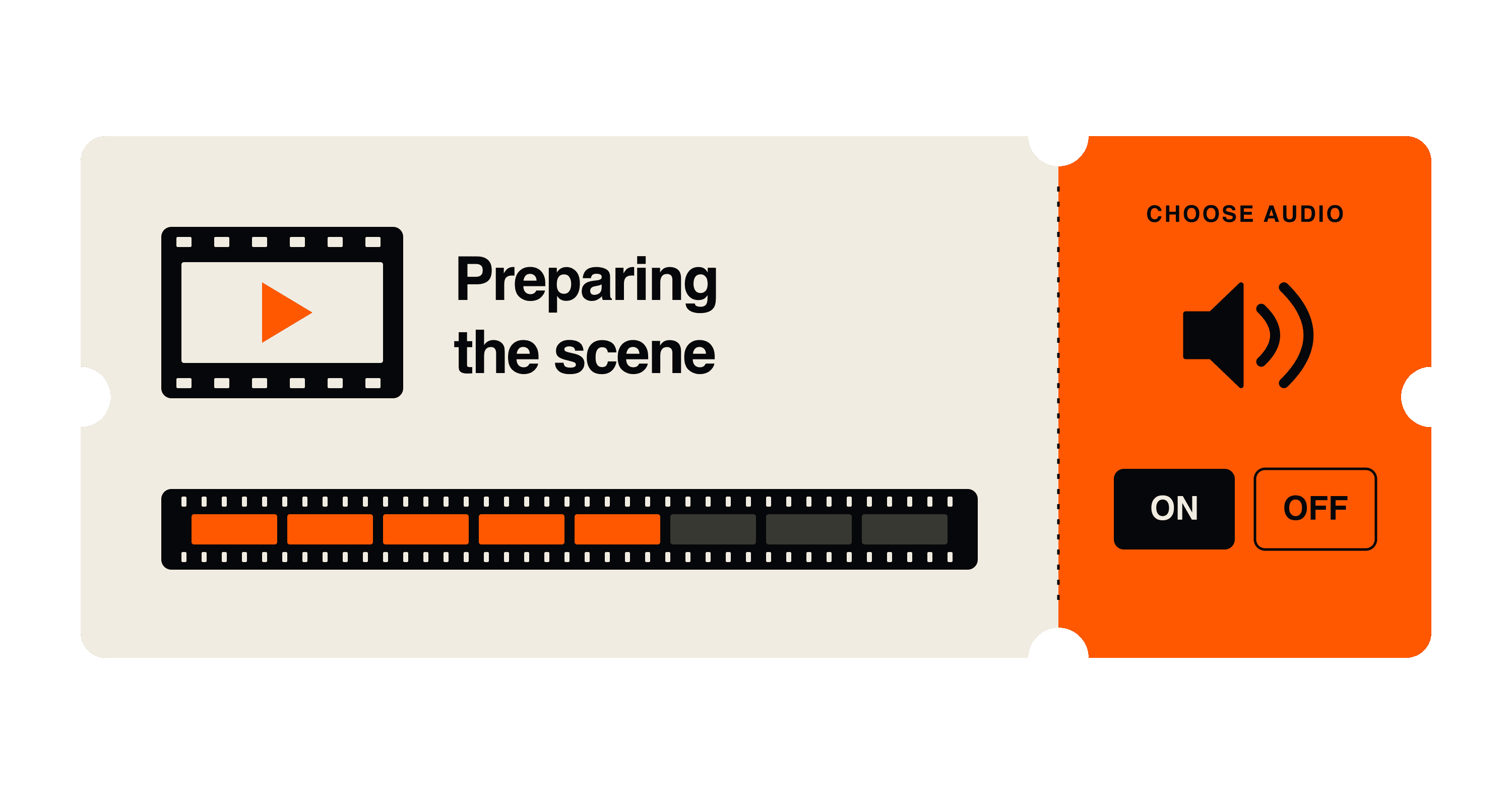
Before Chasing the Moment begins, you get a cinema ticket. It curls as the site loads, and its stub lets you choose whether to enter with sound. A loading screen can prepare you for an experience while the browser gets it ready.
That is the useful question for a heavy website: what can the visitor get from the wait? Our position at Labba is that the loading screen should earn its place within the time the experience actually needs. Once the page is usable, its opening act should let you through.
The ticket has a job
In his 12 October 2026 account on Codrops, creator Canberk Polat explains that visual effects are prepared during loading and the ticket handles the audio choice. The article documents implementation, without visitor research showing that the entrance reduces abandonment.
The decision gives us something specific to examine. Choosing sound belongs before a film starts. Putting that choice on the ticket makes the entrance part of the same world. We can appreciate that connection without treating the rest of the website as a model to follow.
For a team commissioning an immersive experience, we would ask the designer to describe what the visitor gains before the main scene opens. A useful choice is one answer. Learning how the experience works is another. Replaying a logo deserves a harder conversation, particularly if its duration determines when the visitor can continue.
Feeling faster is something we can test
In a CHI 2010 paper, Chris Harrison, Zhiquan Yeo and Scott Hudson tested visual changes to progress bars. In the final experiment, with 16 participants, a standard five-second bar felt equivalent to an animated one lasting 5.61 seconds. Small, controlled comparisons of bars establish a perceptual effect; they cannot predict the performance of a cinematic website.
That distinction matters when someone pitches an entertaining loader. We can investigate whether the wait feels shorter. We still need to measure how long it lasts, whether people understand what is happening, and whether they complete the task they came for. A favourable answer to one question does not settle the others.
There is a second way to use that interval: explain the work. In their 2011 study of simulated travel and dating services, Ryan Buell and Michael Norton found that showing the service's apparent effort could increase perceived value. Their experiments also found limits as waits grew. Those simulations concerned service evaluation, not cinematic page loading.
Our takeaway is to make real work understandable. If an application is comparing available routes, showing that stage could explain the delay. We would not add a pretend search sequence after results are ready just to make the service look more diligent.
Some pages should let you start
A product catalogue presents a different design problem from a webfilm. Imagine arriving to check a price. Being able to read the product name while its photographs arrive would already move that task forward. An introduction that covers the whole page would need to justify taking that opportunity away.
IBM's Carbon loading pattern, updated on 11 August 2026, describes progressive loading: showing the simplest version first, then filling in more detail. It also uses skeleton states, simplified shapes that stand in for unfinished content. These are documented design patterns, rather than proof that one treatment wins everywhere.
For that catalogue, we would start by identifying which information and controls can become available independently. The loading decision then follows the buying task. For the film, the opening scene needs enough preparation to play coherently. The same studio can design both entrances and give them very different forms.
The loader needs its own budget
An opening animation also has a cost. Google's guidance on long tasks explains that JavaScript animation and startup work can share the browser's main thread, where most interface work happens. Long tasks there can delay responses to input. The cost depends on the implementation; motion alone does not establish a performance problem.
We would therefore review the loader on the devices the experience needs to support, alongside the page it introduces. If the entrance needs its own large assets or expensive setup, that work belongs in the same budget. The practical question is how soon someone gets to a meaningful interaction with the whole design in place.
Measure when the door could open
For a review, we would record two moments: when the first meaningful action becomes technically possible, and when the entrance actually permits it. Any gap deserves an explanation. Sometimes a short transition helps someone understand where they have landed. Sometimes the animation is simply waiting for its final frame.
Then we would review a return visit. Someone who enjoyed an introduction yesterday may be coming back for a specific detail today. Letting them continue as soon as the experience is ready is a design requirement we would put in the brief. Reduced-motion and keyboard paths belong in that review too, alongside the motion decisions in the wider design system.
The revealing test may come on the faster connection. When the content is ready before the entrance has finished, the team has to decide whose timing the website follows: the animation's or the visitor's.
Sources
- Canberk Polat, Chasing the Moment, Codrops, 12 October 2026.
- Harrison, Yeo and Hudson, Faster Progress Bars, CHI, April 2010.
- Buell and Norton, The Labor Illusion, Management Science, September 2011.
- IBM, Loading, Carbon, updated 11 August 2026.
- Wagner and Kenny, Optimize long tasks, web.dev, updated 19 December 2024.
![[object Object]](/_next/image?url=https%3A%2F%2Fres.cloudinary.com%2Fdh1xrwguk%2Fimage%2Fupload%2Fv1791397083%2Fblog%2Fai-every-recommendation-cover-en-v3-transparent.png&w=3840&q=75)
![[object Object]](/_next/image?url=https%3A%2F%2Fres.cloudinary.com%2Fdh1xrwguk%2Fimage%2Fupload%2Fv1790966353%2Fblog%2Fbook-of-shapes-rules-v3-transparent.png&w=3840&q=75)
![[object Object]](/_next/image?url=https%3A%2F%2Fres.cloudinary.com%2Fdh1xrwguk%2Fimage%2Fupload%2Fv1790707343%2Fblog%2Fopenai-dots-delegation-product-v4-transparent.png&w=3840&q=75)