Imagine the following scene:
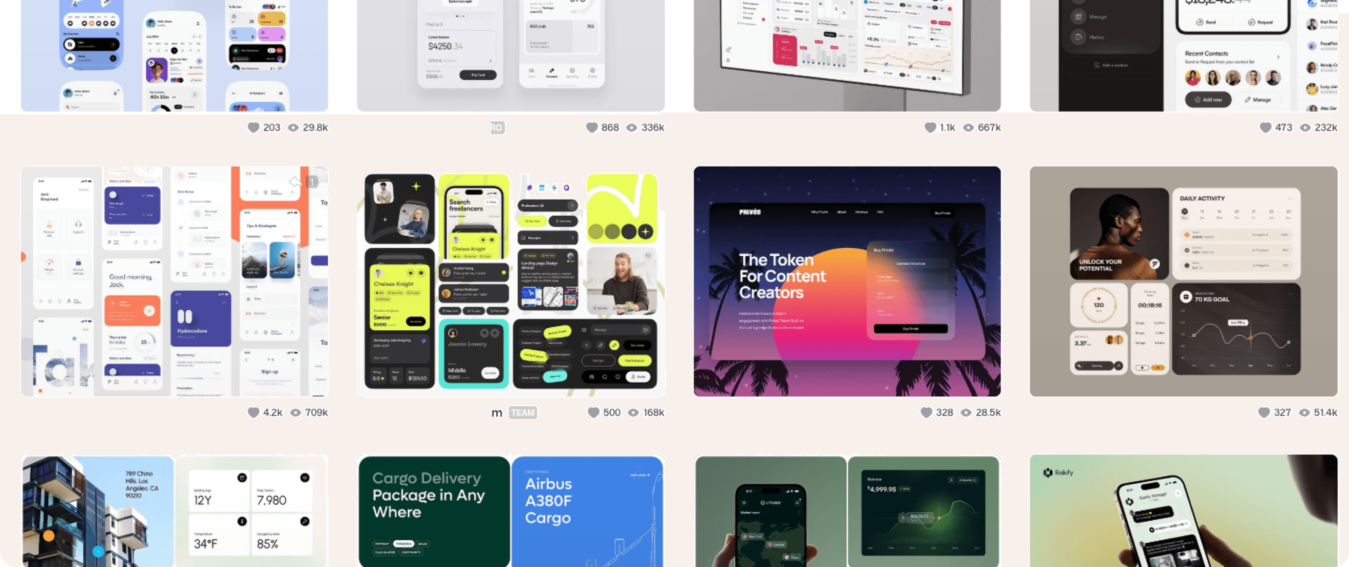
You're designing a product. You log on to Dribbble and become mesmerized by scrolling. You browse through a gallery of screens so clean, so perfect, they seem to float. Perfect gradients, good contrasts, polished fonts, and pinpoint border radius.
Wow. Art.
A home banking app that shows you your balance with a minimalist graph and captivating animation. I wish my bank had an app like that! A weather app with subtly moving sunbeams. A kind of Uber, but with supersonic electric cars and gradients from another planet.
I have bad news for you: that design won't work.
And before you jump on me, I'm not saying they aren't beautiful (they definitely are). But they're fake. They're not real experiences; they're just screens taken out of context. No one got frustrated using them. No user achieved their goal. No one understood if they really worked. These are designs that can only survive on Dribbble. Designs that live only to be looked at, not to be experienced.
At some point, UX stopped being a human-centered practice and became a trendy label. All graphic designers and illustrators became UX designers. Do you know how to use Photoshop? Great, you can now put UX Designer in your LinkedIn bio. The new UX designers didn't do research to understand users, contexts, and behaviors. They didn't design to solve real problems. They stuck to "making it look good." And that's where the internal show of designers for designers was born.
A designer's like is worth more than the frustration of a real user. In what world did we start applauding interfaces that don't solve anything?
The problem with single screens
The Dribbble "shot" became commonplace in digital design. That single screen, visually perfect and taken out of context. Frozen. A piece that is more aesthetic than functional. But where's the rest of the flow? Where are the errors, the empty states, the loaders? What does the button look like when I click it? What about when I hover? What if I forgot my password? It's like looking at a photo from a Wes Anderson movie. For sure, what I see is beautiful. But what's the plot? What's the movie about?
The invisible user
In the world of Dribbble, fantasy designers forgot about the user. A small detail, huh? You often see perfect screens with flawless animations. There are no frustrations, no programming limits, no errors. Everything fits perfectly in their minimalist fictional world.
The problem is that the real user doesn't live in that world. The real user has clumsy fingers, is in a hurry, has bad Wi-Fi, their screen is broken, and maybe they even didn't complete secondary school. They make mistakes, are impatient, and get distracted by the 2-for-1 chocolate notification they just received.
And if you don't take that person's context into your design decisions, you're not doing UX. You're doing decoration.
Leaving accessibility aside
Accessibility is the first victim of Dribbble's fantasy world. When the focus is on beauty, accessibility doesn't matter. Gray text on white backgrounds, 6px fonts, tiny buttons, interfaces impossible to read in sunlight. Designs that practically no one other than a designer could use. Designing for everyone is not optional. Design isn't "good" until it can be used by everyone, regardless of age or physical condition.
Excessive motion
Animation should be applied as a powerful tool to enhance an experience. Not everything has to move. Not everything has to shine. Not everything has to bounce. An interface isn't a stage to showcase your design skills; it's a channel for people to solve their problems fluidly.
The applause ecosystem among designers
The big problem isn't Dribbble itself, but the ecosystem it created; a space where designers design for other designers, and the validation system has become internal (likes, comments, followers). It's logical that we forget about the user if the success of a design is measured in hearts.
There's an even more serious impact, and that's when that logic seeps into the real world. When a CEO or a client says, "I want my app to look like this."
And that's when the wear and tear begins: explaining the basics of UX, explaining why that UI doesn't scale, why that layout isn't accessible, why that brilliant idea only works in an 800x600 PNG.
At Labba, we believe in the design that's used
This isn't about demonizing Dribbble or aesthetics. Beauty matters. Visuals matter. We love to design beautiful products. But real design isn't measured by how pretty it looks, but by how well it works.
At Labba Studio, we design complex digital products: apps, SaaS, platforms. And we've learned from experience: design doesn't end when it looks good. It ends when someone uses it... and something changes.
"Pretty design" may win applause. But real design wins users, trust, and results.