Apple ships iPhone Duo on 23 October 2026, and most of the web conversation about it has been about something Safari does not expose: where the fold is. There is a more basic question underneath. The Duo does not really test whether your site has breakpoints, the widths at which a layout switches. It tests whether your site is still responsive after it has already loaded.
Most teams build as though responsive means three steps: the page loads, something detects the size, the layout renders. A device that changes size in your hands asks for a different shape. The size can change at any moment, and the interface adapts when it does. Those are not the same product, and the second one is rarer than the industry likes to admit.
Why this device asks that question and not another one
Apple publishes both screens. The outer display is 5.4 inches at 1398 by 2034 pixels, the inner one 7.6 inches at 1878 by 2670, and the product page describes an aspect ratio "consistent across the inner and outer display". Content opened on the small screen and then unfolded does not have to become a different thing. It mostly gets more room.
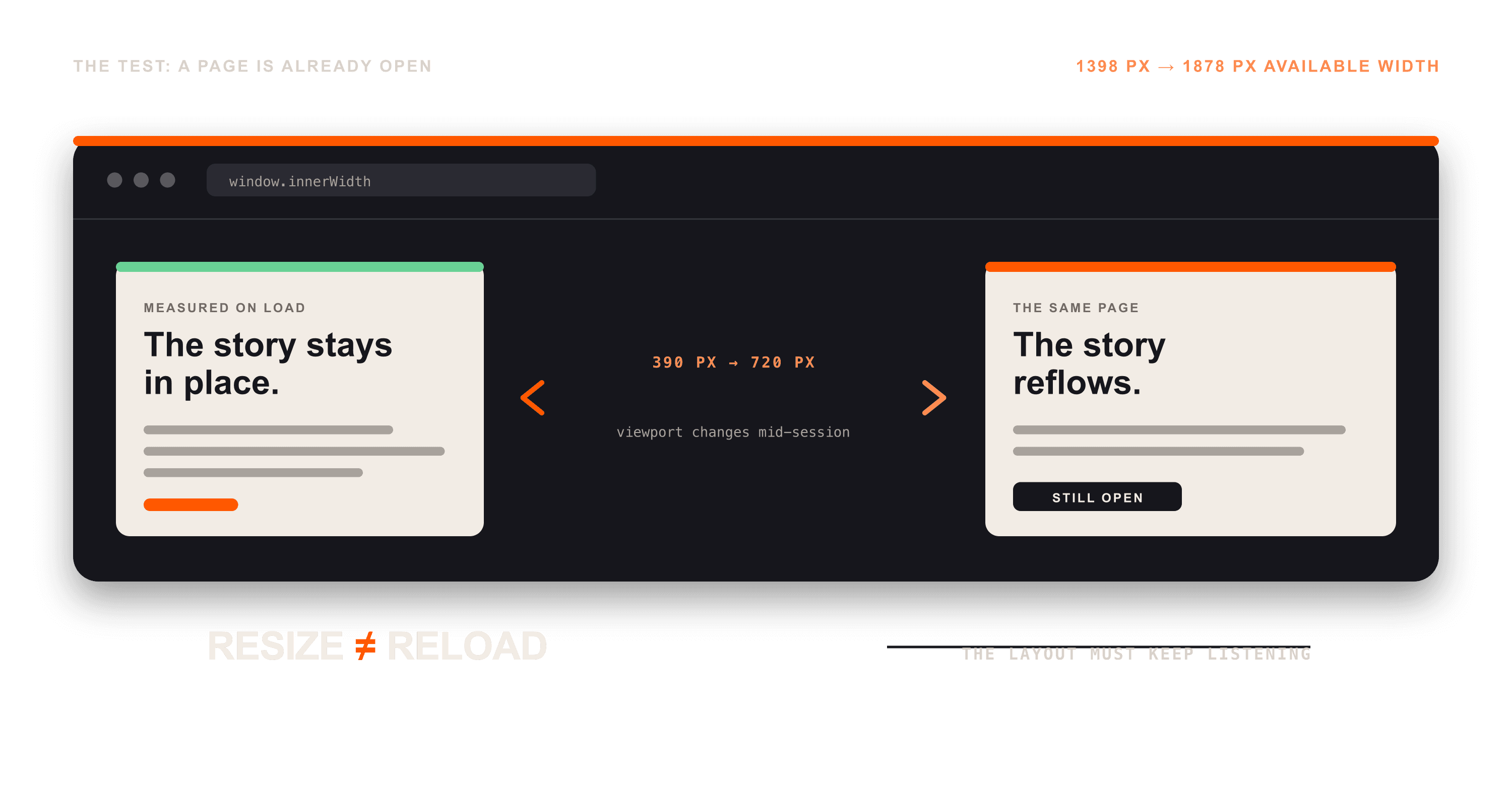
That is what makes the interesting test a plain one. The display goes from 1398 to 1878 pixels across when the device opens. Whether the viewport, the area a page has to draw in, follows that change with the page still open rather than on a reload is exactly what needs testing when the device arrives.
One caveat belongs right here rather than further down. Apple has not published what Safari does to an open page across each pose, and its written guidance, "Preparing your app for iPhone Duo", is listed on the developer page as coming later this month. The exact behaviour is not knowable yet from a primary source, and this article is not going to pretend otherwise. The shape of the risk does not depend on that detail.
Where a layout stops being responsive
The failures are boring, which is why they survive. A component reads window.innerWidth once and keeps the number. A carousel computes its dimensions when it initialises and never again. A canvas or WebGL surface never resizes its drawing buffer. A header decides its state from whichever breakpoint happened to be true at load. A script asks matchMedia() once and stores the answer instead of reacting to it.
That last one has a documented shape. Mozilla describes a MediaQueryList as supporting "both immediate and event-driven matching against the state of the document", and the event-driven half is the part that gets skipped. matches is a boolean about one instant; change is how the browser tells you it moved. Safari has fired that event since version 14.
Which points somewhere more useful. The main tools for building layouts that react to size changes have been available for years. ResizeObserver, which reports changes to an element's dimensions instead of making you measure them yourself, landed in Safari 13.1. Container queries, which style an element from the size of its container rather than the size of the viewport, have been in Safari since version 16. In many cases the problem is not the platform but a layout decision that got fixed in JavaScript at load time, where CSS would have re-evaluated it for free.
Apple is telling native developers exactly this
The advice Apple gives its own developers is the argument of this article, in Apple's words. Its tech talk on preparing an app says "the best app layouts are adaptive across a continuum of devices" and that good ones "avoid making assumptions about display sizes". The design talk is blunter: "Avoid fixed widths, breakpoints, or any metrics tied to a specific screen", and "design your app to be freely resizable and you'll be in good shape".
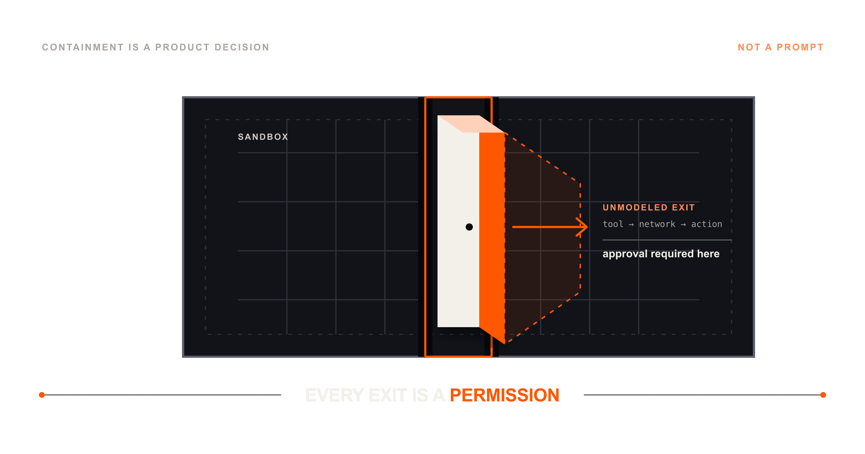
The fold itself is not cosmetic, and it is worth correcting the lazy version of that claim. Apple documents real spatial consequences, including a behaviour that "nudges interactive elements aside whenever iPhone Duo is partially folded", plus reserved regions covering the hinge and the cameras that a native layout can query. The web gets none of that. Mozilla's Viewport Segments API exists to answer "how can you prevent content from being hidden by the physical fold/join?", and compatibility data puts it in Chrome from version 138 with Firefox and Safari at no support. WebKit's public position on the proposal has been open since 6 March 2024. Its only comment, from April 2025, asks whether there is an update. Nobody answered.
You can run this test today
None of this needs a $1,999 phone. Open your own product in a desktop browser and drag the window width around, violently, without refreshing. Then look for:
- Anything measured once at load and cached.
- Layout decisions living in JavaScript that CSS could re-evaluate on its own.
- State fixed by whichever breakpoint happened to be true first.
- Components sized by the device when they should be sized by their container.
Whatever breaks during that is not a foldable problem. It is an assumption that was always there, and a device that changes shape in your hands simply makes it much harder to ignore. Responsive was never supposed to mean a page looks right at several sizes. It means the page can move between them without breaking, and our read is that a good deal of the web has been quietly failing the second half of that sentence for a decade.
Sources
- Apple, iPhone Duo product and technical specifications pages, and the Get ready for iPhone Duo developer page, accessed 17 September 2026.
- Apple tech talks, "Design for iPhone Duo", "Prepare your app for iPhone Duo" and "Strike a pose with adaptive layouts on iPhone Duo", transcripts accessed 17 September 2026.
- MDN Web Docs: Viewport Segments API, MediaQueryList, ResizeObserver and container queries, accessed 17 September 2026.
- WebKit, standards-positions issue 327, open since 6 March 2024.